
Project Overview
Complete brand identity development and print collateral system for Atila Fitness, a local gym offering personal training, strength training, CrossFit, and nutritional education services.
Client: Atila Fitness – Local fitness center
Project Details
- Timeline: 2018
- Role: Brand Designer / Production Artist
- Deliverables: Brand identity, business cards, presentation folders, welcome packet materials
Client Brief
Develop a fresh, modern brand identity for a new fitness facility that appeals to serious athletes and fitness enthusiasts while remaining approachable for newcomers. Create professional collateral system for member onboarding and business development.
Brand Identity Development
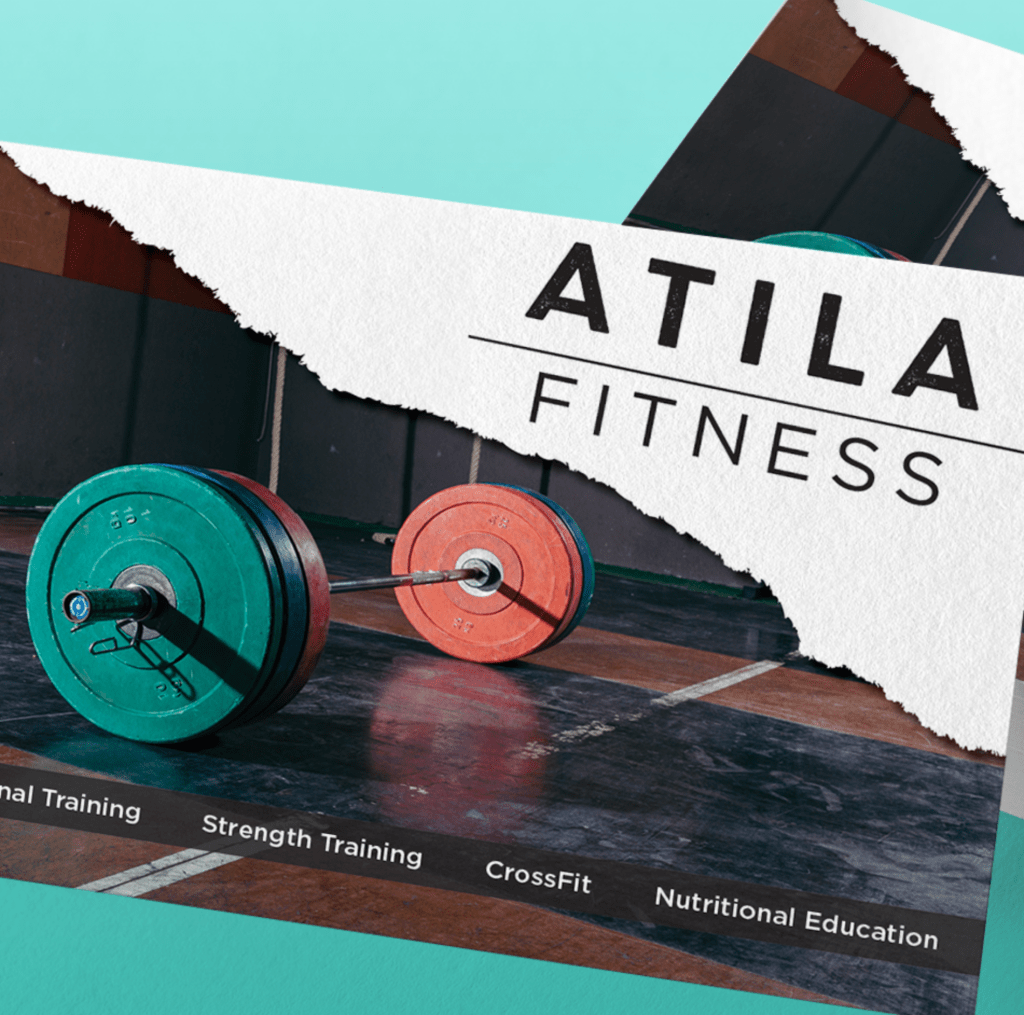
Logo Design: The Atila Fitness wordmark features:
- Typography: Bold, geometric sans-serif with distinctive letter spacing
- “ATILA” treatment: Uppercase with strong, athletic presence and custom letterform details
- “FITNESS” treatment: All caps, lighter weight, positioned beneath with horizontal rule separator
- Overall aesthetic: Clean, modern, powerful—reflecting strength and professionalism
Design Philosophy: The logo balances strength with accessibility. The torn paper edge effect adds organic, human element to otherwise geometric type treatment, suggesting transformation and breaking through limitations—core concepts in fitness training.
Brand Identity Elements
Logo Variations:
- Primary horizontal lockup (ATILA over FITNESS)
- Stacked vertical version for square applications
- Black and white versions for various backgrounds
- Minimum size specifications for business card applications
Visual Language:
- Photography Style: Dynamic gym environment imagery featuring colorful weight plates, authentic training moments, diverse clientele
- Color Palette
- Primary: Black (strength, authority, sophistication)
- Accent: Vibrant coral/salmon pink (energy, approachability)
- Supporting: Turquoise/teal (vitality, wellness)
- Neutral: Clean whites and grays
- Texture Elements: Torn paper edge aesthetic, concrete/industrial gym textures
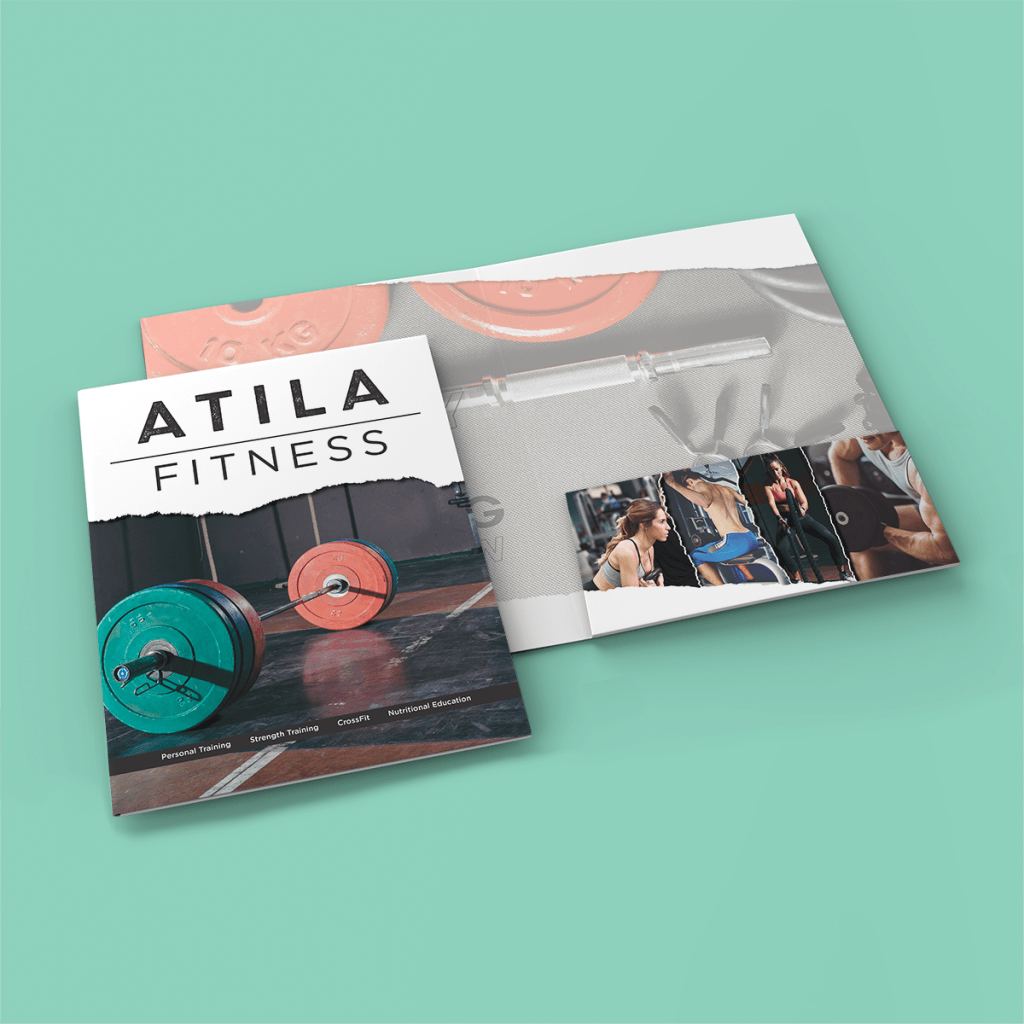
Presentation Folder Design
Structure & Format:
- Standard 9″ x 12″ presentation folder with (1) interior pocket with slits for business cards
- Accommodates standard letter-size documents and business cards
Front Cover Design:
- Hero imagery: Dramatic gym floor photograph featuring colorful weight plates (turquoise and coral matching brand palette)
- Logo placement: White torn-edge badge treatment in upper left, ensuring visibility against photographic background
- Service callouts: Small text identifying core offerings (Personal Training, Strength Training, CrossFit, Nutritional Education)
- Overall effect: Professional, energetic, authentic gym environment
Interior Spread Design:
- Right pocket: Continuation of gym photography with training lifestyle imagery
- Photography montage: Small polaroid-style images showing diverse training activities and clientele
- Lifestyle integration: Balance of equipment shots and human connection moments
- Color coordination: Salmon/coral accent tones in equipment and design elements tying to brand palette
Production Specifications:
- Material: 18pt cover stock (heavy, premium feel)
- Finish: Likely matte or soft-touch lamination for sophisticated, tactile experience
- Printing: 4-color process (CMYK) with potential spot varnish on logo
- Die cut: Standard folder die with two interior pockets and business card slits
- Quantity considerations: Offset printing for cost-efficiency at scale
Business Card Design
Layout & Information Hierarchy:
- Atila Fitness logo as primary identifier
- Contact information clearly presented
- Service offerings listed
- Professional, clean layout maximizing readability
Specifications:
- Standard 3.5″ x 2″ business card format
- 16pt card stock with matte coating
- Full-color printing (4/4 – both sides printed)
- Coordinated design with folder system
Welcome Packet System
Purpose: Comprehensive new member onboarding materials housed in presentation folder including:
- Gym policies and procedures
- Class schedules and program descriptions
- Waiver and membership agreement forms
- Nutritional guidance materials
- Personal training consultation information
- Member benefits and facility amenities
Design Coordination:
- All insert materials designed with consistent branding
- Typography and color palette matching folder system
- Professional document templates for various form types
- Cohesive visual system across all touchpoints
Technical Production Details
Folder File Preparation:
- Created dieline template with fold lines, glue areas, and pocket specifications
- High-resolution photography (300 DPI minimum) for print quality
- Color-managed workflow ensuring accurate reproduction of brand colors
- Bleed specifications (typically 0.125″) for trimming accuracy
- Die line and scoring instructions for print vendor
Prepress Considerations:
- Image optimization for offset printing
- Black generation for rich, solid blacks in photography
- Proofing process for color accuracy
- Paper selection balancing durability with cost
- Coating specifications for appropriate finish
Print Vendor Coordination:
- Specifications sheet detailing all technical requirements
- Material recommendations based on budget and usage
- Quantity recommendations for cost breaks
- Timeline coordination for design approval and production
- Quality control standards and press check procedures
Design Challenges & Solutions
Challenge 1: Photography Integration with Logo Legibility Hero photography needed visual impact while ensuring logo remained prominent and readable.
Solution: Created torn paper badge treatment for logo, providing white background that ensures legibility against any photographic element. Badge design adds brand character while solving practical visibility issue.
Challenge 2: Balancing Intensity with Approachability Gym needed to appeal to serious athletes without intimidating newcomers.
Solution: Combined powerful imagery (heavy weights, serious training environment) with warm accent colors (coral, turquoise) and diverse lifestyle photography showing community and connection. Torn paper texture adds human, organic element softening industrial aesthetic.
Challenge 3: Budget-Conscious Premium Presentation Client needed high-end appearance within moderate print budget.
Solution: Selected 18pt stock providing substantial feel without moving to luxury-tier materials. Strategic use of full-color photography creates impact without requiring expensive specialty printing techniques. Maximized offset printing efficiencies through smart quantity planning.
Challenge 4: Scalable Brand System Identity needed to work across immediate deliverables and future applications (signage, apparel, digital).
Solution: Developed flexible logo system with multiple layout variations. Created comprehensive brand guidelines documenting color specifications, typography usage, and photographic style. Ensured all design elements could scale from small (business card) to large (potential signage).
Brand Guidelines Developed
Style Guide Components:
- Logo usage rules and minimum sizes
- Clear space requirements
- Approved and prohibited logo treatments
- Color specifications (PMS, CMYK, RGB, HEX values)
- Typography system for primary and supporting fonts
- Photography style guidelines
- Texture and graphic element usage
- Examples across various applications
Skills Demonstrated
- Complete brand identity development from concept to execution
- Print collateral design and production
- Photography art direction and integration
- Color theory and palette development
- Typography and hierarchy design
- File preparation for commercial printing
- Die line creation and structural packaging knowledge
- Vendor coordination and specification management
- Budget-conscious design decision making
- Brand system scalability planning
Results & Impact
- Created professional, cohesive brand identity for new fitness facility
- Developed turnkey welcome packet system for seamless member onboarding
- Established visual foundation for future marketing and facility signage
- Provided cost-effective print solutions through smart material selection
- Delivered brand guidelines enabling consistent future applications
Portfolio Significance
This project demonstrates:
- Local business branding expertise
- Complete brand system thinking (identity through application)
- Print production knowledge (folders, business cards, collateral)
- Photography integration and art direction
- Budget management and practical design solutions
- Understanding of service business marketing needs
- Professional collateral development for client-facing materials
Professional Value
Atila Fitness branding showcases ability to:
- Develop complete brand identities from scratch
- Create cohesive multi-piece collateral systems
- Understand client business needs and translate to design solutions
- Execute professional print production for local businesses
- Balance aesthetic impact with production budget realities
- Provide scalable brand foundations for growing businesses
