
A sustainable cosmetics brand with strong values needed packaging that could match its ambition. The existing line lacked shelf presence and didn’t communicate the brand’s clean, petroleum-free ethos in a way that felt modern, confident, or inclusive.
The Goal
Redesign the full product line — hand cream, body lotion, and lip balms — with a visual system bold enough to command attention at retail, cohesive enough to work as a set, and thoughtful enough to carry the brand’s sustainability story without it feeling like an afterthought.
Roles: Brand Strategy & Direction · Structural Dieline Creation · Color System Development · Typography & Graphic Design · Mockup & Presentation · Print Production Specs
The Challenge & Approach
The existing packaging blended into the shelf rather than standing out on it. The design language felt neither gender neutral nor particularly modern, and the brand’s sustainability credentials — petroleum-free formula, compostable tub, recyclable carton — were buried rather than celebrated. The rebrand needed to work across multiple SKUs while feeling like a deliberate system, not a collection of individual labels.
The Approach
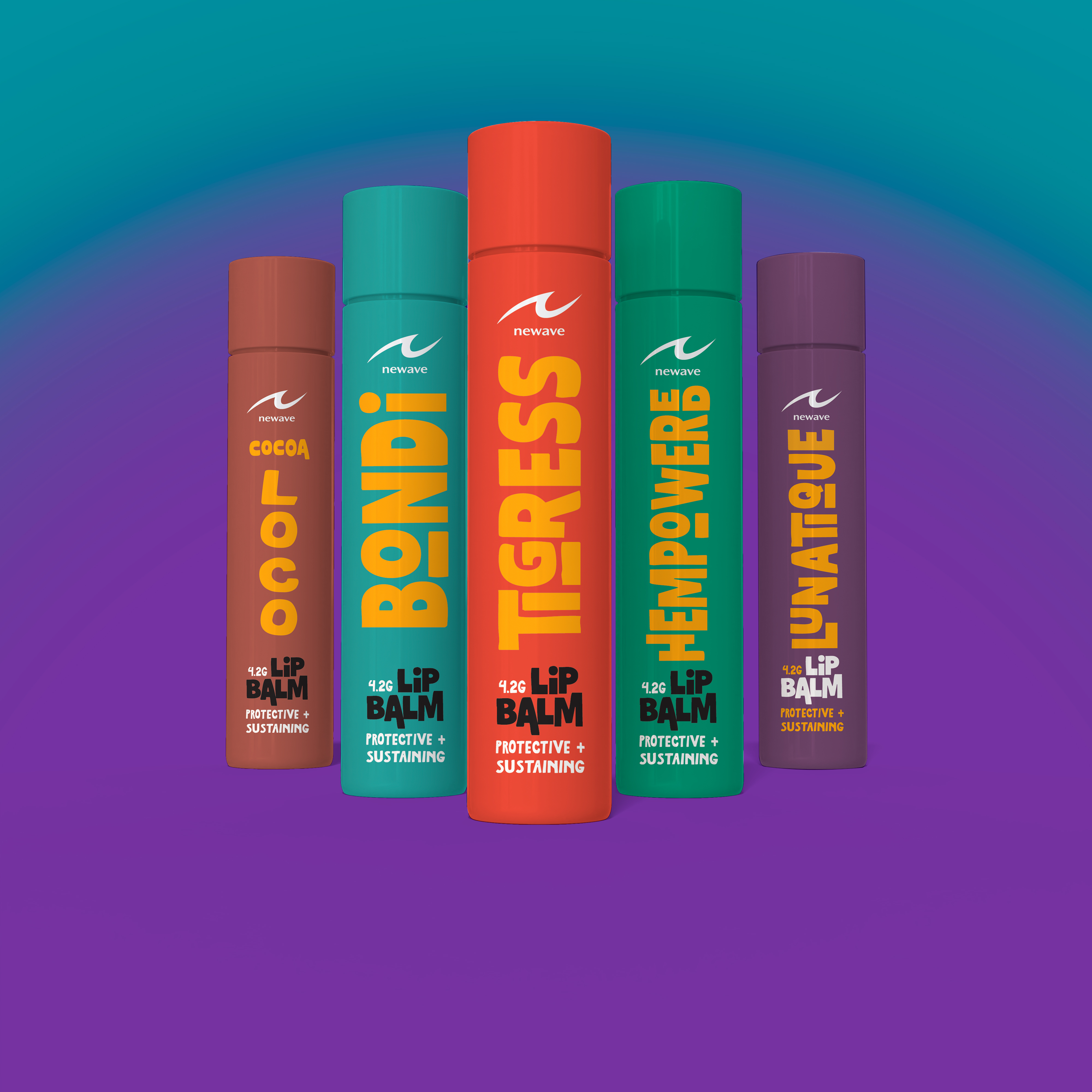
Develop a graphic, typographically bold visual language that could flex across the full product line. Establish a color system where the same palette works across every SKU — but with the colors inverted between products, creating instant visual distinction within a cohesive family.
Make sustainability part of the design itself, not just the copy.
Brand Philosophy
“Love yourself. Love your planet” – Newave positions sustainability as integral to self-care, targeting environmentally conscious consumers seeking effective products without environmental compromise.
How Every Choice Earns Its Place
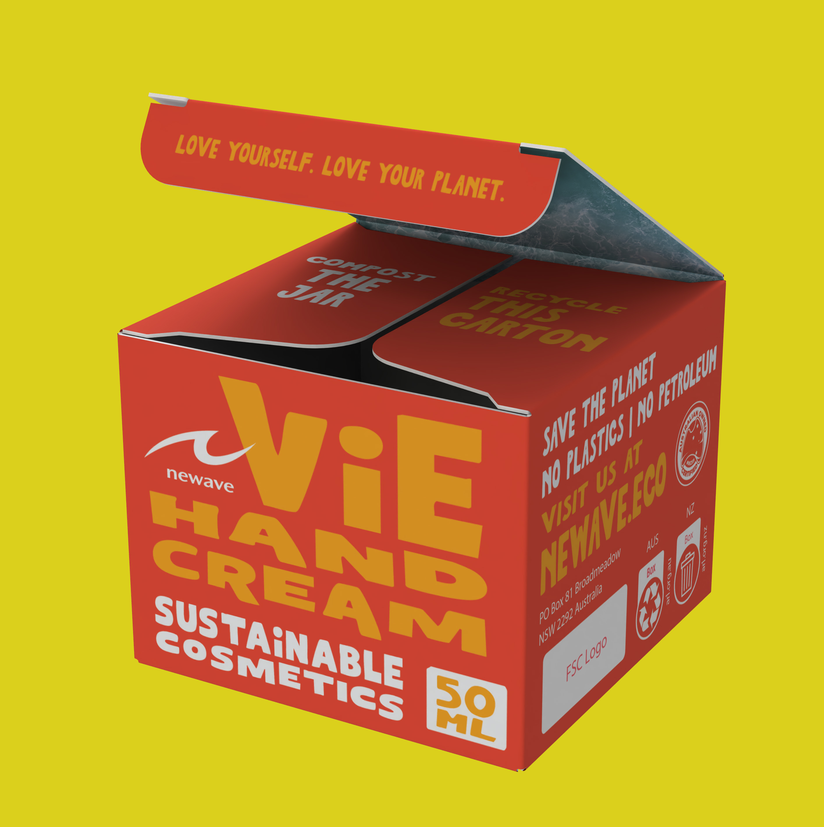
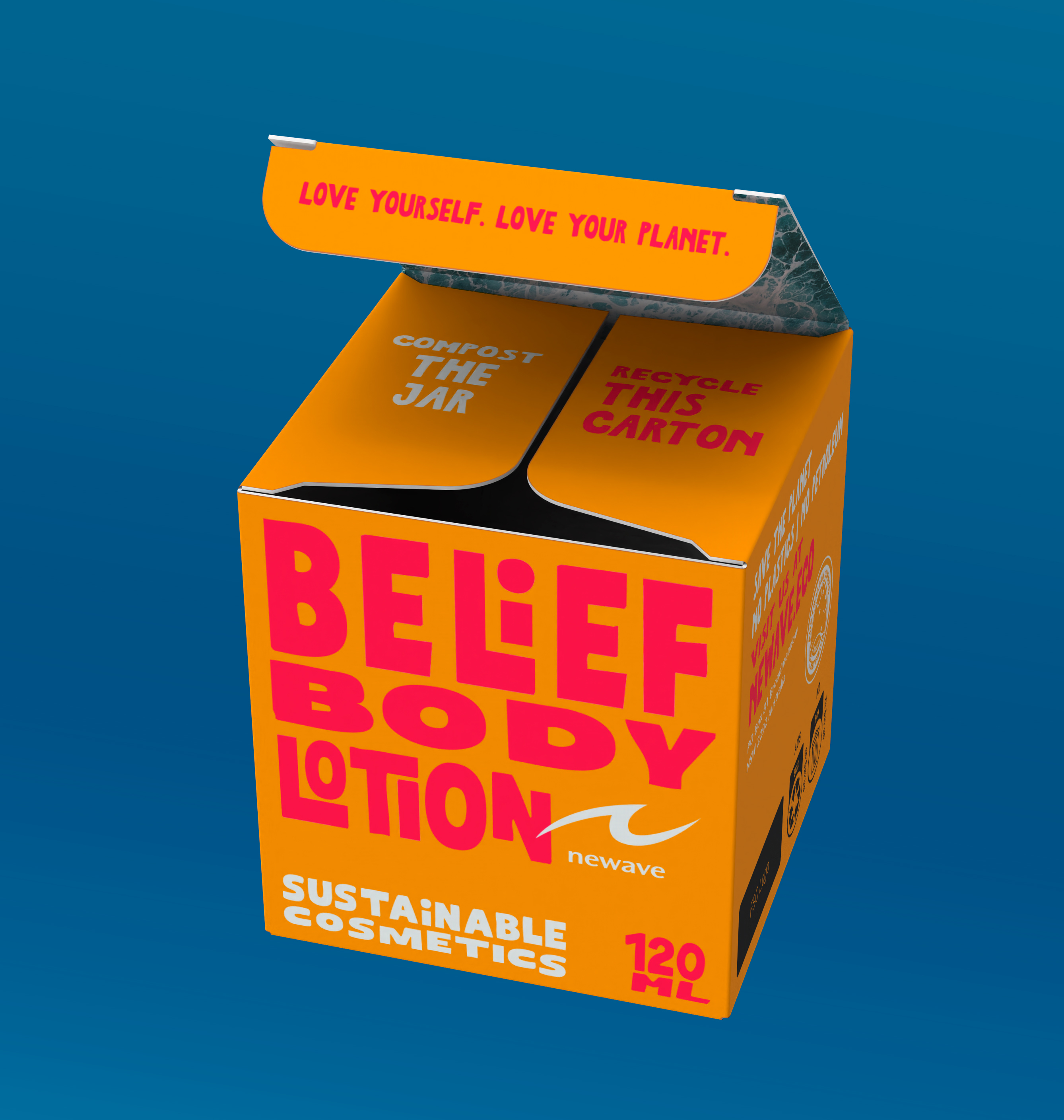
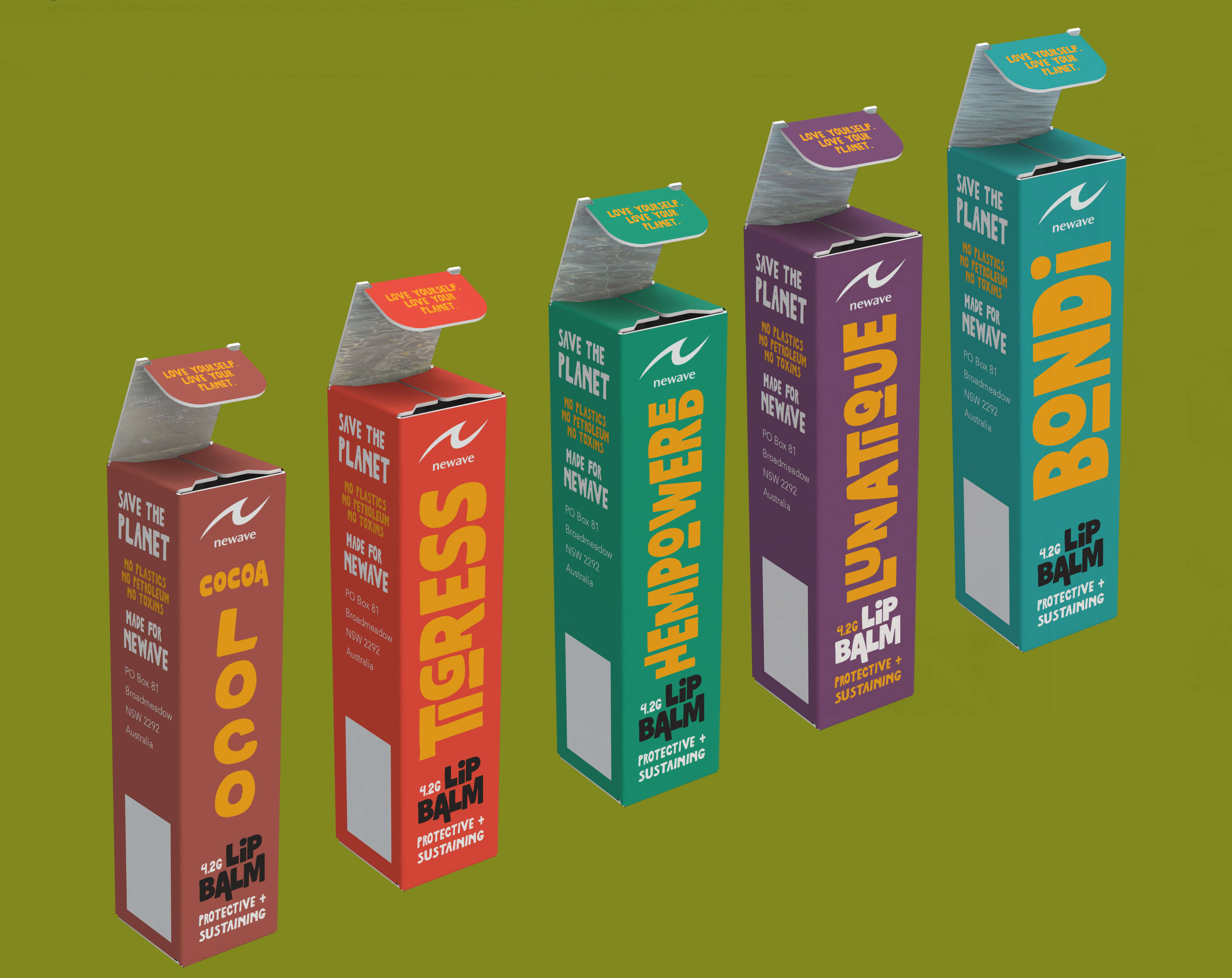
The Color Flip System
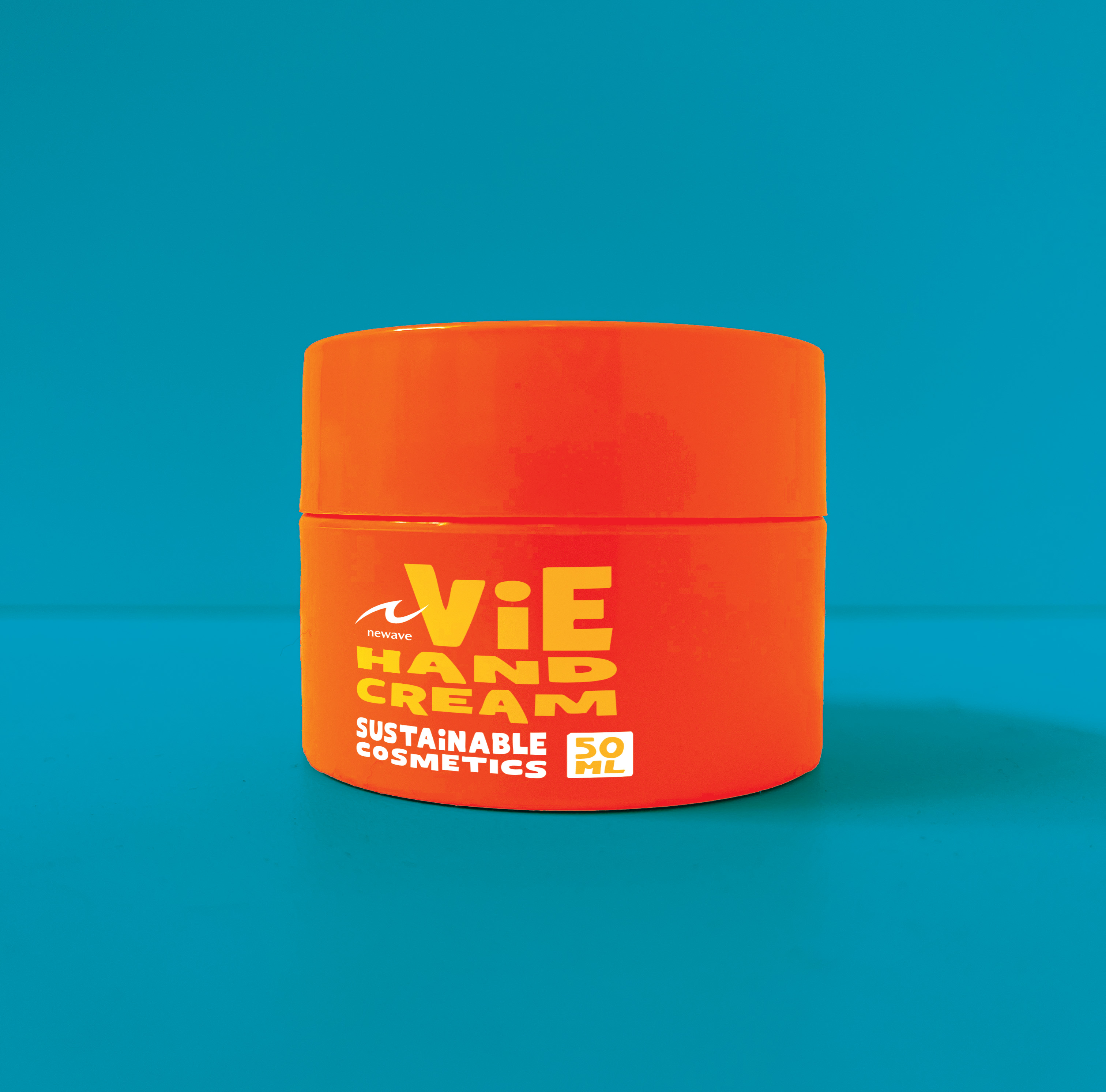
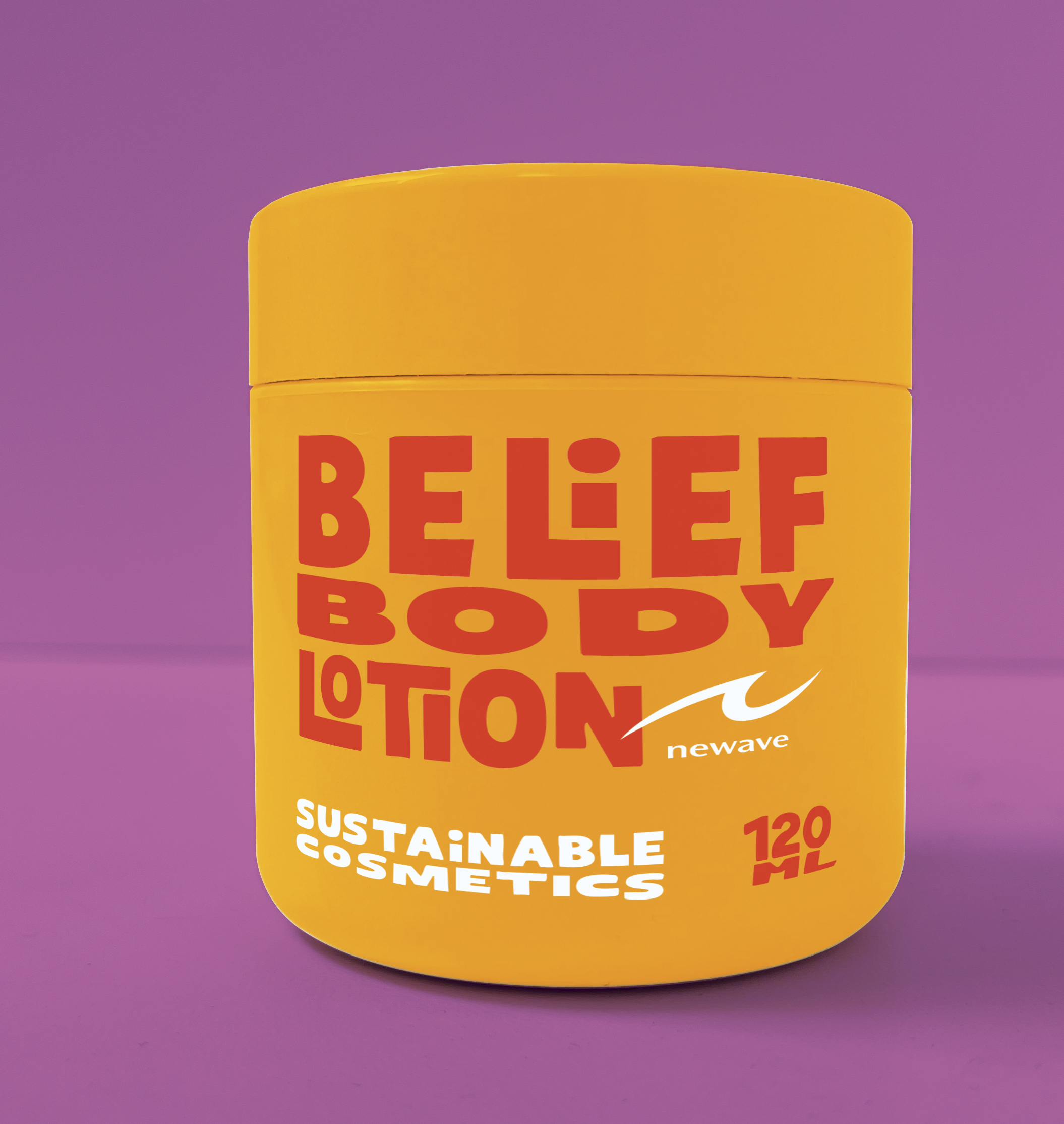
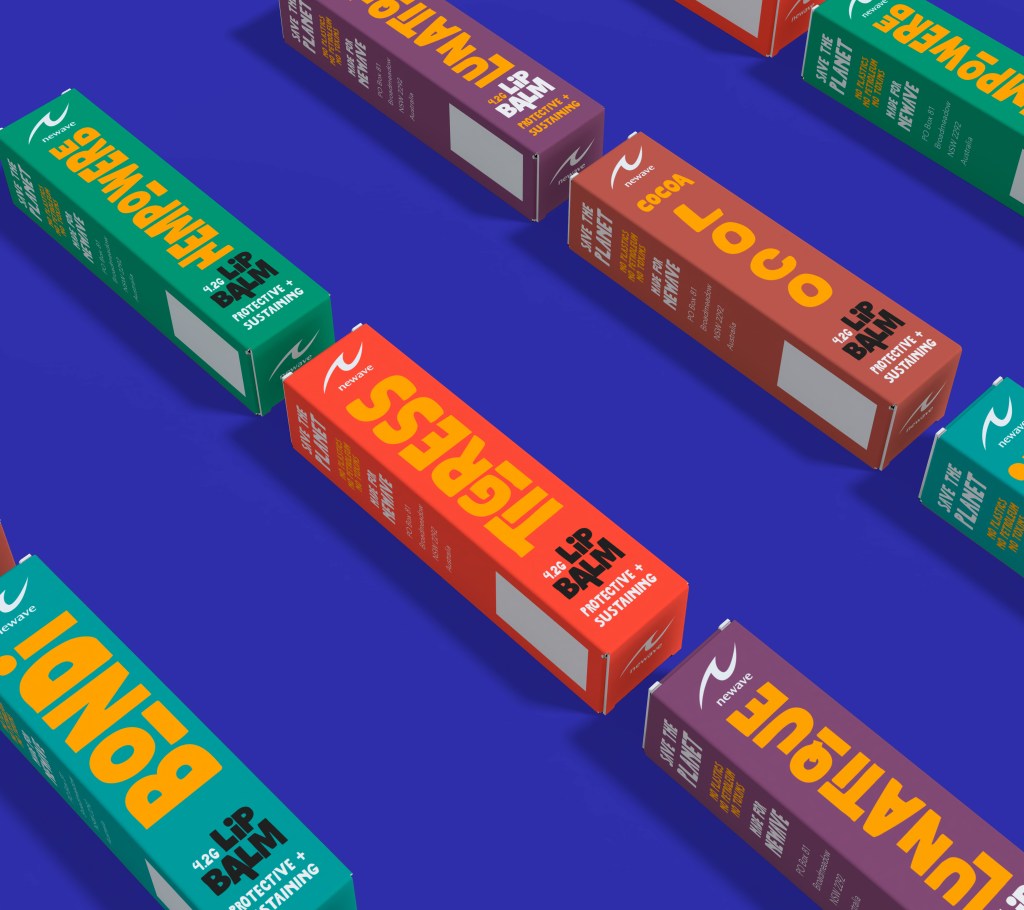
The hand cream and body lotion share an identical two-color palette — but with the background and type colors inverted between products. Red with yellow type becomes yellow-gold with red type. The result is a set that reads as a cohesive family at a glance while giving each product its own clear identity. The system scales cleanly to the lip balm line and any future SKUs.
House Brand vs. Product Brand Hierarchy
The Newave logo is set in white across all products — a deliberate anchor that stays consistent regardless of which color version a product uses. This keeps the house brand quiet and trustworthy while the product names (ViE, Belief) carry the expressive personality. It’s a system that can grow: every future product inherits the same hierarchy without sacrificing individual character.
Oversized, Graphic Typography
The product names aren’t just labels — they’re the design. Filling the front panel with bold, chunky type creates immediate shelf dominance and removes the need for decorative illustration. The typographic treatment is gender neutral by nature: it doesn’t rely on color coding or iconography that reads as gendered. It just reads as confident.
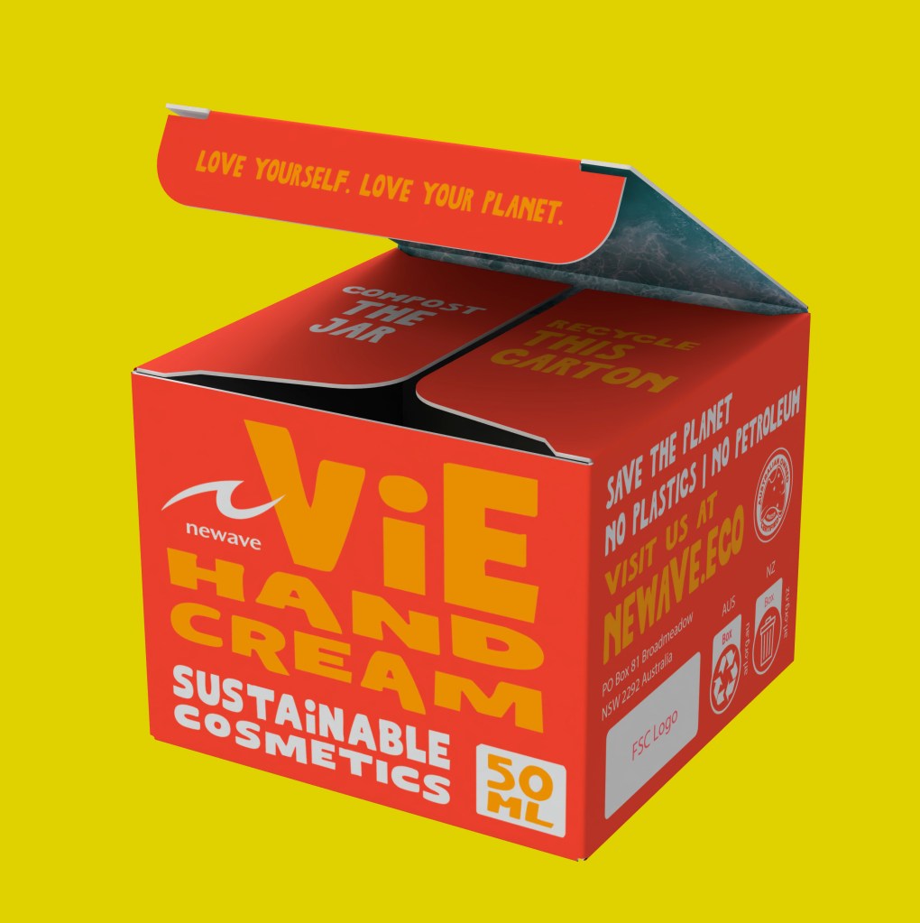
Sustainability as Structure, Not Footnote
“Save the Planet. No Plastics. No Petroleum.” appears as a full graphic statement on the side panel — not a fine-print disclaimer. The product attributes (petroleum-free formula, compostable tub, recyclable carton) are presented in a bold pill-style callout. The brand’s values are legible from across a retail aisle.
The Peekaboo Moment ✦
The interior of the carton is designed to reward the customer the moment they open it. Rather than leaving the inside panels blank or generic, three flap panels carry messaging that turns unboxing into a brand experience:
Love Yourself. Love Your Planet.
Recycle This Carton
Compost the Jar
The sustainability call-to-action lands at the exact moment the customer is most engaged — hands on the product, opening the box for the first time. It’s functional information delivered as a brand moment.
Color System
Same Palette. Inverted Logic.
Both products draw from the same three color system. The flip creates distinction without introducing new brand colors, keeping production costs predictable and visual language tight.
Vie Hand Cream: Red background · Yellow type · White brand mark
Belief Body Lotion: Yellow background · Red type · White brand mark

Yellow – The Universal Anchor
While the colors flip between products, yellow is the one constant that threads through the entire line. The red carton has yellow type. The yellow carton is built on it. Every lip balm carries it. Yellow appears on every single SKU, creating subconscious cohesion across the full range without announcing itself. It’s the color that tells your eye “these belong together” before your brain has time to work it out.
Practically, this also means yellow is always in the production budget and always on process – no new color introduced for new SKUs. The anchor is baked into the system from the start.
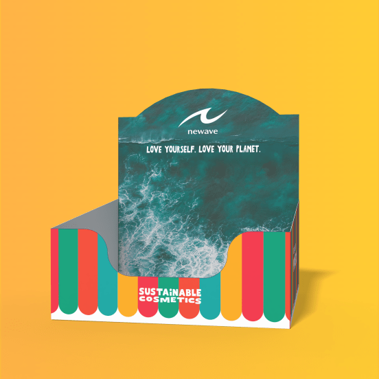
Retail Tray Design Concept: Ocean Above, Beach Umbrella Below
The retail tray design splits into two visual zones. The upper portion carries full bleed ocean photography, rotating with each community photographer submission, with the white Newave logo and tagline sitting clean over the water. The base of the tray features bold color stripes in the brand colors like a classic beach umbrella, anchoring the ocean world to the product color system below it.
The stripe template stays constant across every tray iteration, only the ocean photograph above it changes, so every tray is unmistakably a Newave tray, regardless of which ocean image is featured. And as products sit in the tray, the stripes beneath them echo the packaging colors directly, the tray and product are a visual conversation at the point of purchase.
Brand Language
The Poetry Hidden in the Names
The skincare product naming carries a quiet multilingual story that runs parallel to the brand’s ethos and informed how the visual identity was developed.
Vie – French for Life
A hand cream called Life. The most elemental act of self-care, named for existence itself. Bold, direct, universal. Exactly like the design.
Be·Lief – English “Belief” + Dutch “Lief” (Beloved)
Hidden inside the word belief is the Dutch word “lief” meaning dear, sweet, beloved. A body lotion that asks you to believe in yourself, with the word for beloved quietly tucked inside. Love yourself. Love your planet.
Life. Beloved. New Wave.
Vie (life) + Belief (beloved) + Newave (new wave) – the brand’s full naming system tells a coherent story about renewal, self-love, and planetary care without ever saying it directly. The visual identity was designed to carry that same quiet confidencce: bold enough to be seen, layered enough to be felt.
Beyond the Packaging
A Full Brand Ecosystem
The redesign concept extends beyond individual SKUs into a complete brand world from retail environment to community activation.
Interior Packaging Printing – Ocean Photography
Where the exterior is bold and graphic, the interior tells a different story. Full bleed ocean photography on the inside of the carton transforms the unboxing moment. The customer opens the box and finds the ocean looking back at them. “Love yourself. Love your planet printing on the face of the lid dust flap. The exterior shouts on the shelf. The interior whispers something meaningful.
Retail Display Trays – Ocean Photography System
Rather than featuring one product color over another, the retail trays use full-bleed ocean photography with the Newave log in white – sitting above the product color system entirely. Every SKY lives equally within the tray. The ocean imagery is the brand’s neutral ground, belonging to all products and none of them exclusively.
Beach Cleanup Popup Activations
The brand’s owner runs monthly beach cleanups – a brand activation opportunity hiding in plain sight. Popup materials (banners, canopies) carry the same ocean photography system: full-bleed ocean imagery, white Newave logo, “Love Yourself. Love Your Planet.” as the anchor line. The sustainability message that lives inside the carton becomes the entire environment at the event.
Reusable Merchandise – Totes & Water Bottles
Reusable cotton tote bags and branded water bottles distributed at beach cleanup events carry the bold color graphics visual system. Handing someone a reusable tote and water bottle while picking up single-use plastic at a beach cleanup is a brand moment no advertisement could buy. The merchandise becomes the message.
Community Ocean Photography Submission Program
An open submission program inviting ocean and ocean wildlife photographers to contribute images for use across retail trays, interior carton printing, and event materials. Every photographer whose work is featured becomes a brand advocate. The program keeps the visual library fresh season to season, creates community ownership of the brand, and connects the brand’s sustainability values to the people who care most about the ocean, the ones photographing it.
What This Work Demonstrates
Brand Systems Thinking
A scalable color and hierarchy sysem designed to grow with the product line – from individual SKU to full retail and event environment.
Structural Dieline Creation
Full dieline development from scratch, accounting for all panels, flaps, bleed, interior printing, and regulatory copy placement.
Print Production Fluency
Design developed to perform across both digital and spot color print processes. Interior ocean photography spec’d for production alongside exterior bold graphics.
Retail Environment Design
Retail display tray concept using ocean photography as a color-neutral unifying system – every SKU represented equally at point of purchase.
Unboxing Experience Design
Interior flap messaging and ocean photography turn a functional moment into a brand touchpoint, sustainably delivered at peak customer engagement.
Brand Activation Strategy
Beach cleanup popup materials, reusable merchandise, and a community ocean photography submission program extends the brand from shelf to shoreline.
Community Program Development
Ocean photographer submission program concept turning brand advocates into content creators and keeping the visual library alive season to season.
Values-Driven Design
Sustainability integrated structurally at every touchpoint – not appended as copy, but built into how the packaging works and how the brand shows up in the world.
Packaging Design · Brand Systems · Retail & Event Activation · Print Production
