
Project Overview
Comprehensive brand identity development and jar label design system for Pollen & Sun Co., an artisanal honey producer and bee rescue organization that combines small-batch honey production with environmental advocacy.
Client Brief
Create a warm, approachable brand identity for a honey company that positions bee conservation and rescue as central to their mission. The brand needed to communicate artisanal quality, environmental stewardship, and the personal, handcrafted nature of their products while standing out in the competitive specialty foods market.
Brand Mission
“Hand Made With Love” – Pollen & Sun Co. connects consumers to the source of their honey while supporting bee rescue and habitat preservation. Each jar represents both a quality product and a contribution to pollinator conservation.

Brand Identity Development
Logo System:
- Primary lockup: “POLLEN & SUN CO.” with dimensional slab serif lettering
- Typography: Vintage-inspired letterforms that evoke heritage craftsmanship
- “POLLEN” rendered in signature coral pink with inline detail
- “& SUN CO.” in charcoal gray for contrast and balance
- Decorative banner element containing “est 2018” positioned centrally
- Enclosing oval frame creates classic badge aesthetic
Brand Messaging Architecture:
- Top arc: “• HAND MADE WITH LOVE •”
- Bottom arc: “• HONEY & BEE RESCUE •”
- Tagline clearly communicates dual purpose: premium product + conservation mission
Color Palette:
- Primary Brand: Coral Pink (warm, approachable, memorable)
- Secondary: Charcoal Gray (grounds the design, adds sophistication)
- Tertiary: Cream/Off-white (provides breathing room, vintage feel)
- Accent colors vary by product variant (berry blue, wildflower red)
Product Line & Label System
Variants Developed:
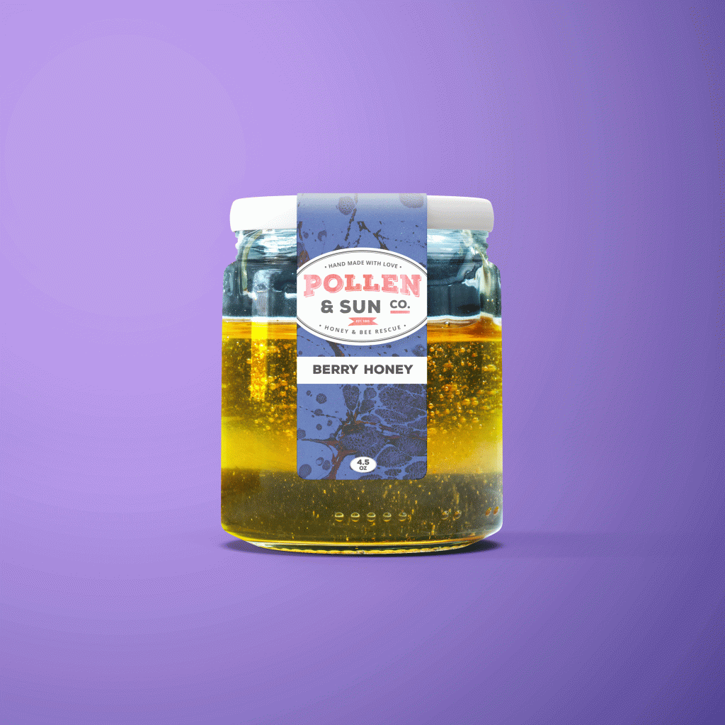
- Berry Honey – Blue/purple botanical illustration background
- Wildflower Honey – Red/coral floral pattern background
Label Format:
- Size: 4.5 oz Jar
- Application: Pressure-sensitive adhesive label
- Dimensions: Vertical orientation wrap label
- Material: Premium white Bopp stock with moisture resistance and matte lamination
Label Design Architecture
Visual Hierarchy
Top Section – Brand Badge:
- Oval framed logo lockup
- Establishes immediate brand recognition
- Consistent across all variants
Middle Section – Decorative Pattern Band:
- Product-specific illustrated backgrounds
- Berry: Botanical sketches of berries, bees, and floral elements in duotone blue
- Wildflower: Abstract watercolor florals in red/coral tones
- Patterns suggest flavor profile while maintaining artistic quality
Product Name Panel:
- White rectangular panel ensures maximum legibility
- Bold sans-serif typography for product variant name
- High contrast against decorative backgrounds
Bottom Section – Product Size:
- Small oval badge containing “4.5 OZ”
- Subtle but clear weight declaration
- Positioned in lower pattern area
Brand Collateral System
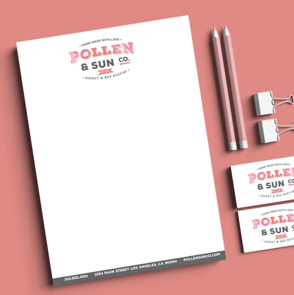
Letterhead Design:
- Clean, minimal layout with brand logo at top
- Generous white space for professional correspondence
- Footer contains contact information in gray band:
- Phone
- Address
- Website
- Reinforces brand professionalism for B2B communications
Business Cards:
- Multiple visible in mockup suggesting consistent brand system
- Logo-forward design for farmers market and retail partnerships
Technical Specifications
Label Production:
- Print Method: Digital or flexographic printing for short to medium runs
- Color System: 4-color process + spot color (brand pink PMS) for consistency
- Substrate: Moisture-resistant matte paper suitable for refrigeration
- Adhesive: Permanent pressure-sensitive, food-safe
- Finish: Matte lam for premium tactile quality
- Dieline considerations: Wrap-around application with front-facing focus
Jar Specifications:
- Format: 4.5 oz (approximately 130g) hexagonal glass jar
- Closure: Black metal twist-off lid with safety button
- Label coverage: Front panel with potential wrap to back
- Shelf presentation: Labels designed to face-forward for maximum impact
Color Management:
- Brand pink specified as spot color for consistency across all materials
- Pattern backgrounds use process colors for cost efficiency
- White panels knocked out for maximum contrast
Design Strategy
Target Market:
- Conscious consumers valuing sustainability and ethical sourcing
- Specialty food shoppers seeking artisanal alternatives
- Gift buyers looking for meaningful, local products
- Bee conservation supporters
Shelf Presence Strategy
- Vertical orientation maximizes brand visibility in crowded specialty food sections
- Bold color backgrounds create high contrast against competitor products
- Pattern illustrations add visual interest that draws eye from distance
- Clear product naming prevents confusion at point of sale
Storytelling Elements:
- “Hand Made With Love” conveys personal care and quality
- “Honey & Bee Rescue” immediately communicates mission
- Illustrated backgrounds suggest natural sourcing and biodiversity
- Badge format evokes heritage and trustworthiness
Brand System Scalability
Expandability Features: The design system supports growth through:
- Modular pattern approach allows unlimited flavor variants
- Consistent badge placement enables instant brand recognition
- Color-coding system can accommodate 10+ SKUs without confusion
- Layout structure works across multiple jar sizes (tested concept shows adaptability)
- Pattern library can expand while maintaining visual cohesion
Potential Line Extensions:
- Additional honey varieties (lavender, orange blossom, buckwheat)
- Beeswax products (candles, wraps, balms)
- Honey-based condiments (mustards, glazes)
- Gift sets and seasonal collections
Skills Demonstrated
- Brand identity development from concept to execution
- Food packaging design and FDA labeling compliance
- Illustration integration and pattern design
- Typography for small-format packaging
- Print production for specialty food industry
- Multi-SKU system architecture
- Collateral system development (letterhead, business cards)
- Market positioning through visual design
- Sustainable packaging material selection
- Photography art direction (for portfolio mockups)
- Retail merchandising considerations
Prepress Deliverables
Complete File Package:
- Vector logo files (AI, EPS, PDF formats)
- Label dielines with bleed and safety zones
- Print-ready PDFs with embedded fonts and images
- Pattern artwork as separate layer files for flexibility
- Color specifications (PMS and CMYK values)
- Typography style guide
- Brand standards manual showing proper logo usage
- Mockup templates for product visualization
- Letterhead and business card print files
- Technical Documentation:
- Label dimension specifications
- Substrate and finish recommendations
- Adhesive specifications for food contact
- Color matching standards
- File preparation guidelines for print vendors
- Application instructions for jar labeling
Results & Impact
Created a distinctive brand identity that:
- Clearly communicates artisanal quality and conservation mission
- Differentiates from corporate honey brands through authentic storytelling
- Provides strong shelf presence in specialty food retail environment
- Scales effectively across multiple product variants
- Builds emotional connection through “made with love” positioning
- Supports premium pricing strategy through elevated design execution
- Functions across all brand touchpoints (packaging, collateral, digital)
